UI Overrides
Developers can also override some of the default UI components in the AI chat area with their own React components.
Usage
You can override the JSX of certain UI components by including a custom container component to the AiChat component
with your JSX elements inside it.
Example where the default loader spinner is replaced with a custom spinner:
const MyAiChatApp = () => {
    const myAdapter = useChatAdapter({ /* Your adapter options */ });
    return (
        <AiChat adapter={myAdapter}>
            <AiChatUI.Loader>
                <span className="rounded">Loading 👻</span>
            </AiChatUI.Loader>
        </AiChat>
    );
};
Overrides Available
Below is a list of UI component overrides that are currently supported:
Loader
This enables overriding the loading spinner displayed in 2 locations:
- Inside the default submit button, when it's in a loading state.
- Under a message, when it's being loaded from the server or streaming.
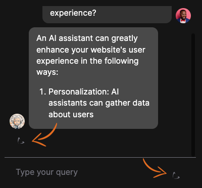
You can override it with your own JSX element by using the AiChatUI.Loader component:
- Overriding Container:
AiChatUI.Loader- Usage:
<AiChat adapter={myAdapter}>
    <AiChatUI.Loader>
        <span className="rounded">Loading 👻</span>
    </AiChatUI.Loader>
</AiChat>
Greeting
The Greeting component (previously referred to as the Welcome Message component) is displayed when the chat is first
opened, and when the conversation history is empty.
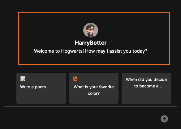
You can override it with your own JSX element by using the AiChatUI.Greeting component:
- Overriding Container:
AiChatUI.Greeting- Usage:
<AiChat adapter={myAdapter}>
    <AiChatUI.Greeting>
        <span className="rounded">Hello! 👋</span>
    </AiChatUI.Greeting>
</AiChat>
Adding More Overrides
We will be adding more customization options and overrides as we receive feedback from the community.
If your project requires more customization options, please let us know:
- You can either open an issue on the GitHub Discussions page
- Or simply suggest it in the NLUX Discord server
UI overrides are only supported for the React JS version of NLUX at the moment.